
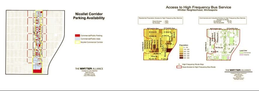
These two maps show different aspects of transportation in Whittier. The final map on the left gives a detailed look into the various parking availability along the Nicollet corridor. The maps on the right shows what areas of the neighborhood are served by high frequency bus service, meaning that the locations are within a ¼ mile of a high frequency bus stop.
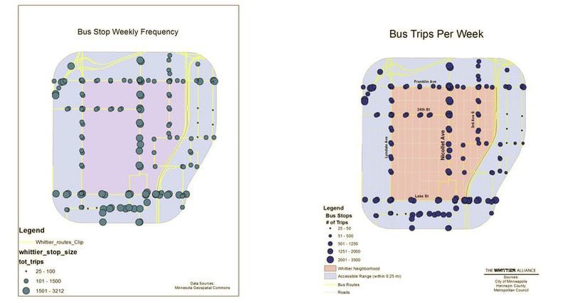
The two maps shown here provide a look at the actual number of bus stops per week at each stop. The left map is a more preliminary version of the final map on the right, which breaks down the number of stops into a wider range of numbers of bus stops. The final map also provides a more in-depth legend, street names, and more vivid colors to make the information more understandable to the user.
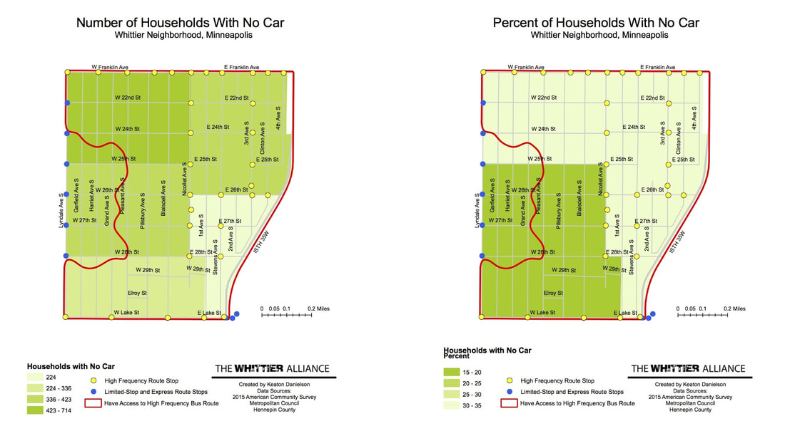
The two maps shown here provide information to compare the high frequency bus service availability to the amount of households without a car. The left map shows the number of households without a car in relation to bus service availability, whereas the map on the right goes a little further to show the percentage of households without a car in relation to the same transit availability data.
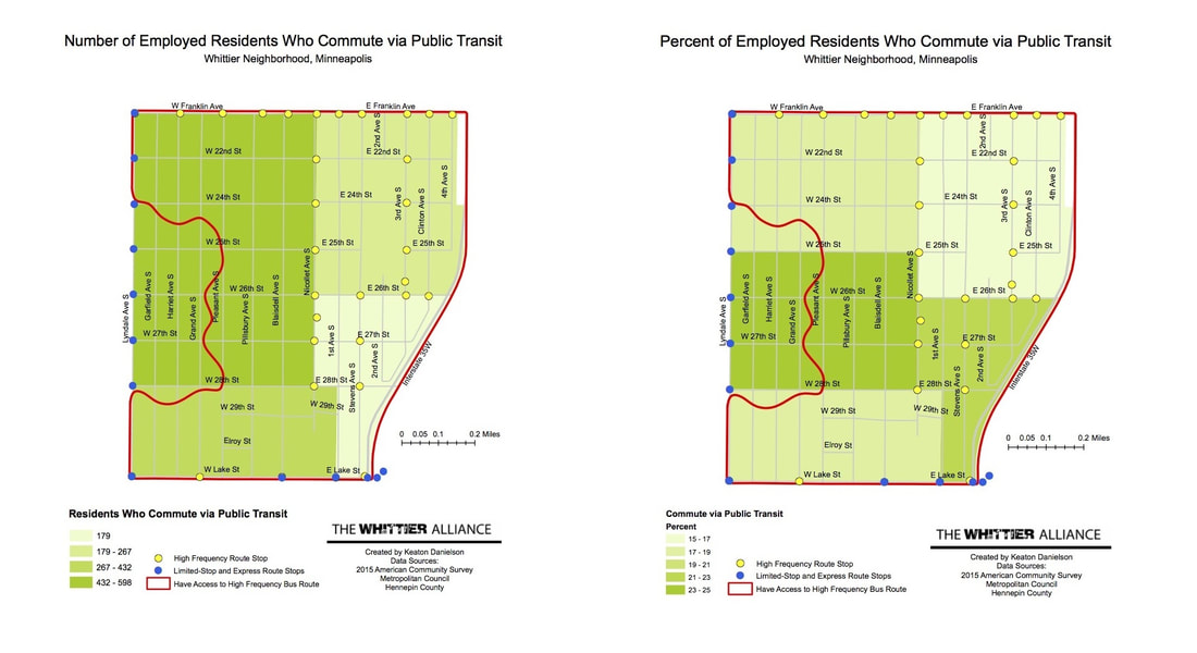
These two maps show the same bus service information as the previous two maps, but show different population data, which in this case, is based on commuters rather than households. The left map shows the number of residents in each area who commute using public transit, whereas the map on the right shows the percentage of residents who commute using public transit.
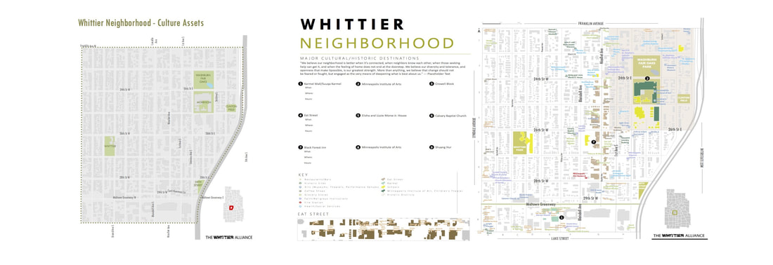
The cultural assets in Whittier are the focus of these two maps. The left map shows the locations of parks within the neighborhood. The map on the right goes much deeper to include a variety of cultural assets, including various points of interest including; parks, restaurants, shops, schools, arts centers, religious institutions, human services, and more. Note the smaller inset map just to the left the larger one, which gives a more detailed view of the businesses along the Eat Street corridor.